26.06.2026
Why Fast Shipping and Good Product Rarely Coexist
Read article →
#vibe-coding#chatgpt#claude#web-development#ai
So hello guys, are you tired of trying backdrop-blur-sm, backdrop-blur-xl, etc., and still not satisfied with the blur? Sometimes it looks awful.
Let me give you an example of two types of blur:

Here you can clearly see an edge. There is a visible line that separates the blurred area.
2. Progressive blur

In the second picture, you can see that the separating line is gone. The blur looks much more professional while still keeping the header distinct from the rest of the content.
So the question is: how can you build this?
There are two ways to build this. I’ll show you from the easiest to the hardest.
→ First, using a gradient mask image.
You can create a gradually blurred SVG in Figma and use it directly in your project. The downside is that it may not produce the exact result you want. You’ll also have limited customization over the blur and how you apply it in your project.
→ Using pure CSS with some math.
You can look at examples like MagicUI or ReactBits. I found ReactBits to be complex, with external dependencies and heavy math.
Then I found a simpler CodePen example that was easier to understand.
After spending an hour studying it, I was finally able to build my own progressive dynamic blur component with no external libraries and much simpler logic.
progressiveblur.tsx code Link
How the Progressive Blur Work
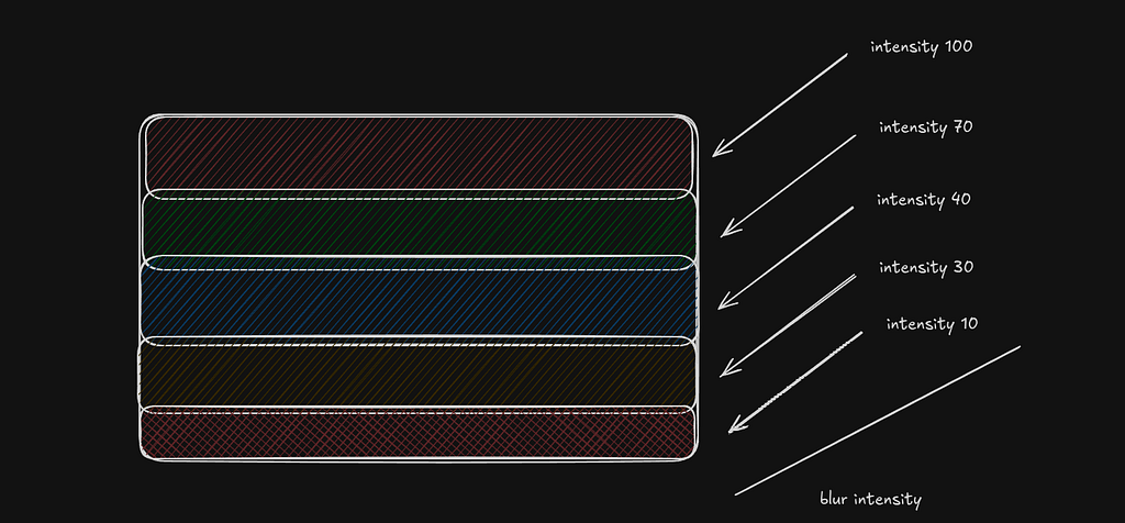
This picture shows how a progressive blur works.
Instead of applying the same blur everywhere, the blur is divided into multiple horizontal layers. Each layer has a different intensity.
At the bottom, the blur is very light. As you move upward, the blur slowly increases. By the time you reach the top, the blur is much stronger.
The idea is simple: stack several sections on top of each other and gradually increase the blur value. This creates a smooth transition. It removes the harsh visible line you usually get with a single backdrop blur and makes the header feel naturally separated from the rest of the content
Where does progressive blur shine?
This type of blur adds a clean, premium feel to the UI and improves the overall user experience.
Some Example of Progressive from Internet
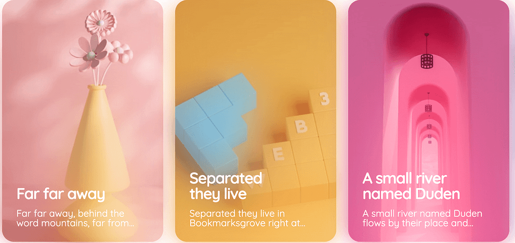
Some Portfolio that uses Progressive blur